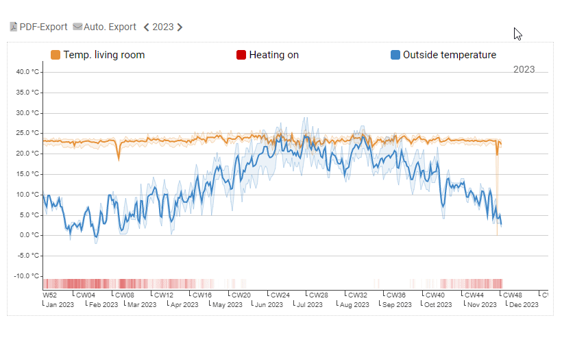
Chart
The chart is used for the graphical visualization of time series. Via drag & drop several tags can be added to a chart. A Y-axis is added for each unit used in the tags. The time range can be preselected via a relative specification (e.g. Last 30 days) and can be adjusted outside the editing mode by clicking on the time selection.
Configure series
A configuration section appears for each new tag added. Depending on the data type, different settings can be configured:
| Color | Color of lines, areas or bars |
| Series type |
Numeric tags can be plotted in different ways:
|
| Interval | Interval in which the historical data is aggregated. When Auto is selected, the optimal interval of the selected time range is used. Optionally, an interval can be specified so that the same display is always used (e.g. daily values). |
| Aggregation |
Selection of how the historical data should be compressed:
|
Configure axes
Tags with identical unit share one Y-axis, which can be configured as follows.
| Grid lines | Drawing horizontal grid lines. |
| Min | Fixed start value of the axis (If not specified: Lowest value less than 0) |
| Max | Fixed end value of the axis (If not specified: Largest value of the time series) |
| Digits | Fixed number of decimal places |
Compare time ranges
If the same tag is dropped to the chart more than once, it is displayed with an time offset. If the preset time range is the current day, the previous day is displayed if offset = 1. For each additional drop of the tag, the offset is increased by one so that one tag can be compared to multiple historical time ranges. The offset can be changed in the time series settings. For example, select an offset of 7 to compare the data of the current day with the same weekday of the previous week.
Interaction with the chart
Within the chart, the time range can be selected or zoomed with the mouse. The legend can be used to show and hide series and open the tag information.
Special modes
Besides the simple display of time series, AnyViz offers additional charts. To create a special chart, click on the highlighted bar next to chart.
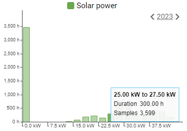
Histogram Chart
A histogram is a special chart for the visualization of the frequency distribution. All recordings of the selected period are grouped and distributed on the X-axis. In the Y-axis, the duration in hours is indicated in which the values were active. The tooltip also shows the number of measurements.
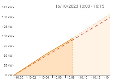
Load triangle chart
The load triangle is mainly needed for energy management to avoid load peaks. It shows the already consumed/generated quantity of the current quarter hour, as well as the forecasted quantity at the end of the quarter hour (dashed). If the predicted quantity exceeds the configured limit (dashed red), the color changes.